Remote View
A Map of Baseball Nation (Published 2014)
A Map of Baseball Nation (Published 2014)

www.nytimes.com A Map of Baseball Nation (Published 2014)
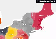
Facebook data reveals the most popular team in every ZIP code.

A Map of Baseball Nation (Published 2014)
Facebook data reveals the most popular team in every ZIP code.
The Mets don’t even dominate the zip code their home stadium is in; they don’t show on the map at all.
The Athletics don't dominate anywhere, either. Though they're nomads right now, so it isn't too surprising.
This is a cool map. Are people really just downvoting this because they don’t like sports? Get over yourselves.
People on lemmy have a weirdly intense hatred of sports, I’ve noticed.
Sports, cars, playing video games anywhere besides Steam/GoG… off the top of my head. There’s a lot of things I find people are overly zealous about on here.
Man i do hate sports...but i don't downvote em
If you’re on mobile and dumb like me thinking the map is missing teams, zoom in.
Not a fan of baseball but this is really cool. Are there more maps like this?
The New York Times used to do all sorts of interesting maps and graphs--
https://www.nytimes.com/interactive/2015/07/08/us/census-race-map.html
Awesome links. I would love to see the second one with updated data.
It's always the Yankees.
i dont understand what pink is
You can select areas and it will tell you the distribution. If you’re talking about the SLC area, looks like there is a mix of Red Sox and Yankee fans. No clue why the hell that is though